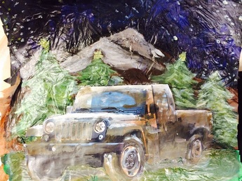
 This is a collage photo i have created, it contains tissue paper, gesso, gel, acrylic paint, and a handmade jeep/truck. First i layer the sky out with blues, blacks, and purples. Second i put down the mountains, third i layer down the grass. I then painted over the layered tissue paper. After that i glued the JEEP on to the project and blended the JEEP with the background by putting mud all over the jeep and covering the tops with snow to make it look like it came from the snowy mountains in the background. Overall i have emotionally changed from the prep project and this final project because i couldn't find a idea at first but then i figured it out and with a little bit of work this came out. I would do this project again if i can find a great idea again.
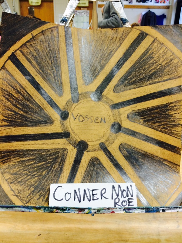
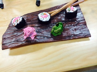
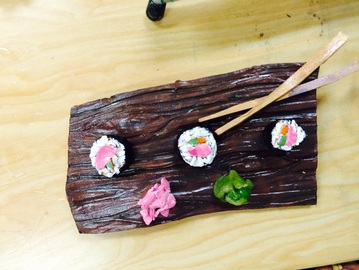
For this project i decided to go with the idea of Travel and adventure. I mainly used National Geographic magazines because they had images from all around the world. In my picture i have created a sky layer, a mountain layer, grass layer and desert layer. I cut out pictures and put them together and they all flowed very well. The hardest part of this project was finding pictures it was very time consuming looking through 10 magazines and only getting 3 pictures. For my final project i have decided to use tissue paper because it takes less time to find what you want. Overall this project is not very fun because the magazines do not contain the images i want, i think i should bring my own magazines in. 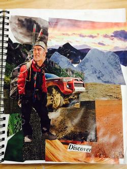 In my Clay project i decided to create sushi. I started by creating the sushi. The first wall i hit was forming sushi so that i could get all the aspects and futures of the sushi. Then I formed the Wood Plank. I decided to make the wood plank warped looking with grain streaks to make it most realistic. I would agree that i made the board too warped but others like it, so i kept it. I am thankful for all the input from others, the tips they gave me made a huge difference it how good the project turned out. My dislike was the value in the green wasabi it turned out looking to dark and unrealistic. I defiantly limited my self because i messed around during class and i understand that wasting time is a big difference in the quality of the product. Overall if i was to do this project again i would choose this one over many of the projects because this was the most fun,using the clay and painting was extra. In the close up drawing. i drew a close up of a Audi wheel. I chose this because i am very fond of Audi's and thought this fit the best for this project. The Audi wheel covered some aspects including repetition, and close up. The only thing that i wish i could of done was having color because adding value is a struggle for me. The Value in my drawing was very weak and could of been 10x's better. I wish i had use a different background.If i could do this project again i would make this wheel colorful, it would defiantly help. Overall this is one of my least favorite projects and i wish i had chosen a different object that is easier to draw.
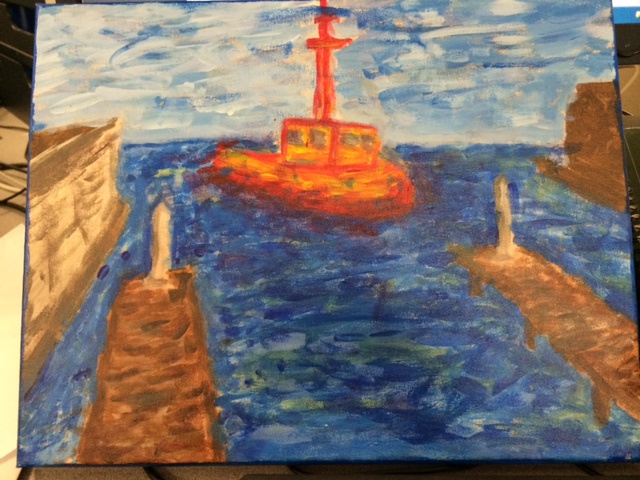
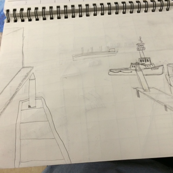
 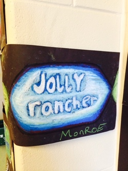 In art 2 we have been drawing candys in class using different methods. We used color pencil, chalk, and oil pastel. The most difficult was the peppermint using chalk and the easiest was the lollypop using color pencil. My favorite was the lollypop because it was the easiest to accomplish and turned out the best. IF i was do to do this project again i would put more detail into my jolly rancher drawing and would use more darks in it. Overall it was a okay project if i was going to choose to do this i would probaly opt out. 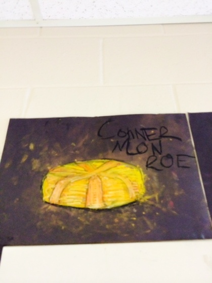 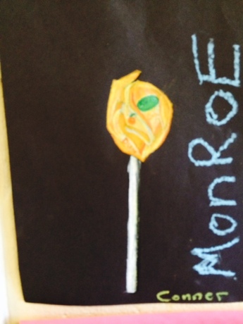 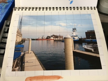 I painted a bay in Baltimore in the style of impressionist because my artist was a impressionist. Impressionist paintings are very different that many styles. Impressionist techniques are short brush strokes using light colors. The painting appears almost blurry but the viewer is still able to put the picture together with their eyes. My photo is from when i was in Baltimore, Maryland in the bay during the summer off and it is of boats sitting in the water. When i was painting this canvas i used light colors and mixed all my paints with only white. The painting took a lot of time because i put layers of different shades for the sections, Overall i don't think it turned out very good because of poor planning i would have liked to have a different artist, but it was fun to try something new. Next time i will prep better for any of my art pieces because i am learning that preparation is the key to success to anything. I also took out a lot of the background because the technique is already a struggle so it help make it easier . I have learned that Monet is a awesome artist and i can appreciate him more, the more i paint in his style.
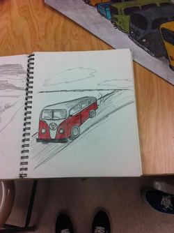 In this project we were supposed to draw objects or a landscape repeating and showing perspective. I chose to draw VW BUS's repeating off into the distance where a beach lays in first perspective . The cons of my drawing were having to round off the edges of the BUS's but ended up better than expected with some help from MS. ROSSI. Another con was the poor planning on whether to shade or color, but I decided to go with both which I personally think looks sweet. I wish that I could have done this project in water color because I believe it would look better but the colors I chose to color the bus's made up for it. This was a great project to open up the semester to and the skills learned in this project will defiantly come in handy in future art projects. Overall great project and if I were to do it again I might try the 5 point perspective because they look really awesome. 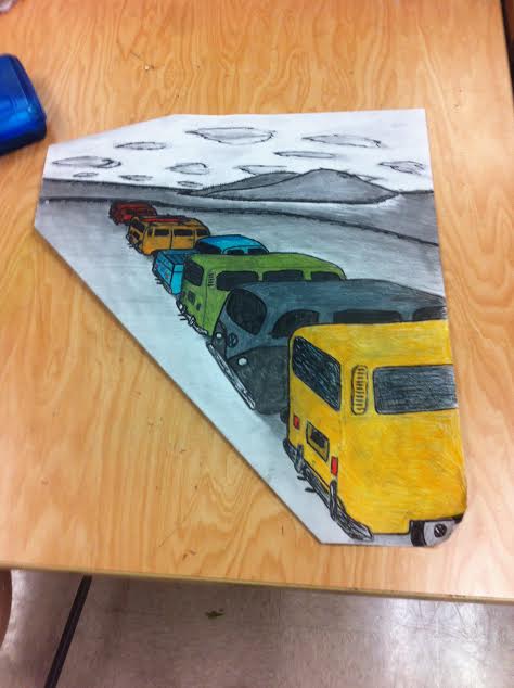
|
Archives
April 2015
Categories |

 RSS Feed
